Understanding the Importance of Image Optimization
Why Image Optimization Impacts Your Website’s Soul
Have you ever clicked on a website only to watch the dreaded loading circle spin…and spin? Frustrating, right? That could be because the site didn’t prioritize image optimization. Let me tell you why this seemingly small step holds so much weight.
First off, images are the lifeblood of a visually appealing site. But, oversized, unoptimized images can act like anchors, sinking your site’s load time and sending visitors packing. Did you know a slow-loading page increases bounce rates by up to 32%? Ouch.
Think of it this way: optimizing images is like decluttering your suitcase before a trip—same great stuff, just packed smarter. By resizing and compressing, you’re saving bandwidth while keeping your visuals stunning. And let’s not forget the SEO boost! Search engines love fast sites, and optimized images mean faster load times, which can give your rankings a gentle nudge upwards.
- Speed = Happy Visitors: Faster pages keep users engaged and reduce frustration.
- SEO Matters: Optimized images help search engines understand and rank your content.
Skipping image optimization? It’s like trying to run a marathon in heavy boots. Don’t hold your website back.
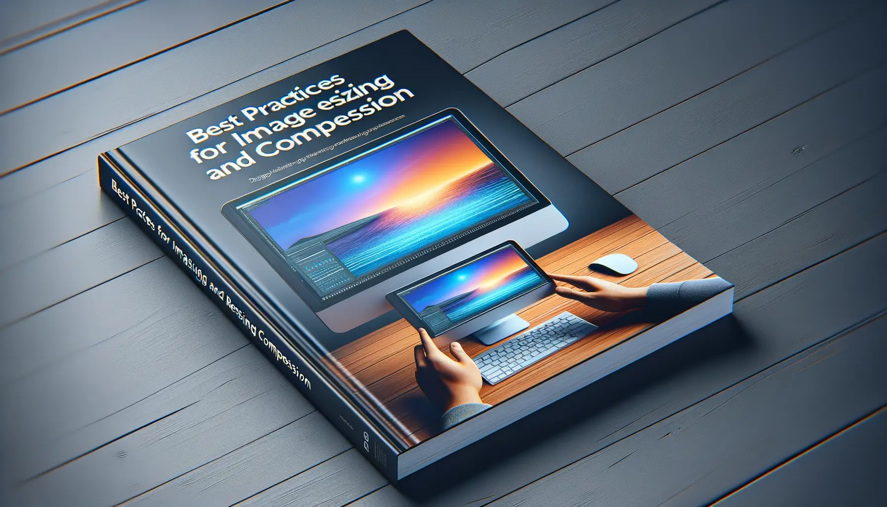
Best Practices for Image Resizing and Compression
Why Resizing Is Your Image’s Best Friend
Ever tried squeezing a huge beach ball into a tiny cupboard? That’s what loading oversized images does to your website. To make your site load like a dream, bring your images down to the size they actually need to be—no larger, no smaller. For instance, if your banner image only displays at 1200px wide, don’t upload a monster 4000px version.
Not sure where to start? Just follow this quick checklist:
- Measure your image display dimensions on the site first.
- Use tools like Photoshop, Canva, or even free online alternatives like GIMP to resize.
- Save different-sized versions for desktops, tablets, and mobile screens to cater to all devices.
Tiny adjustments, massive results.
The Golden Rule of Compression
Here’s a truth bomb: Uncompressed images can be website killers. But don’t panic—it’s fixable! Compression reduces file size without murdering quality. Tools like TinyPNG or ImageOptim are lifesavers for this.
For striking a balance between quality and performance, aim for a file size under 500KB for most images. And remember: Test obsessively! Is your high-res product photo still crisp after compression? If yes, you’re golden. If not, tweak those settings until it is.
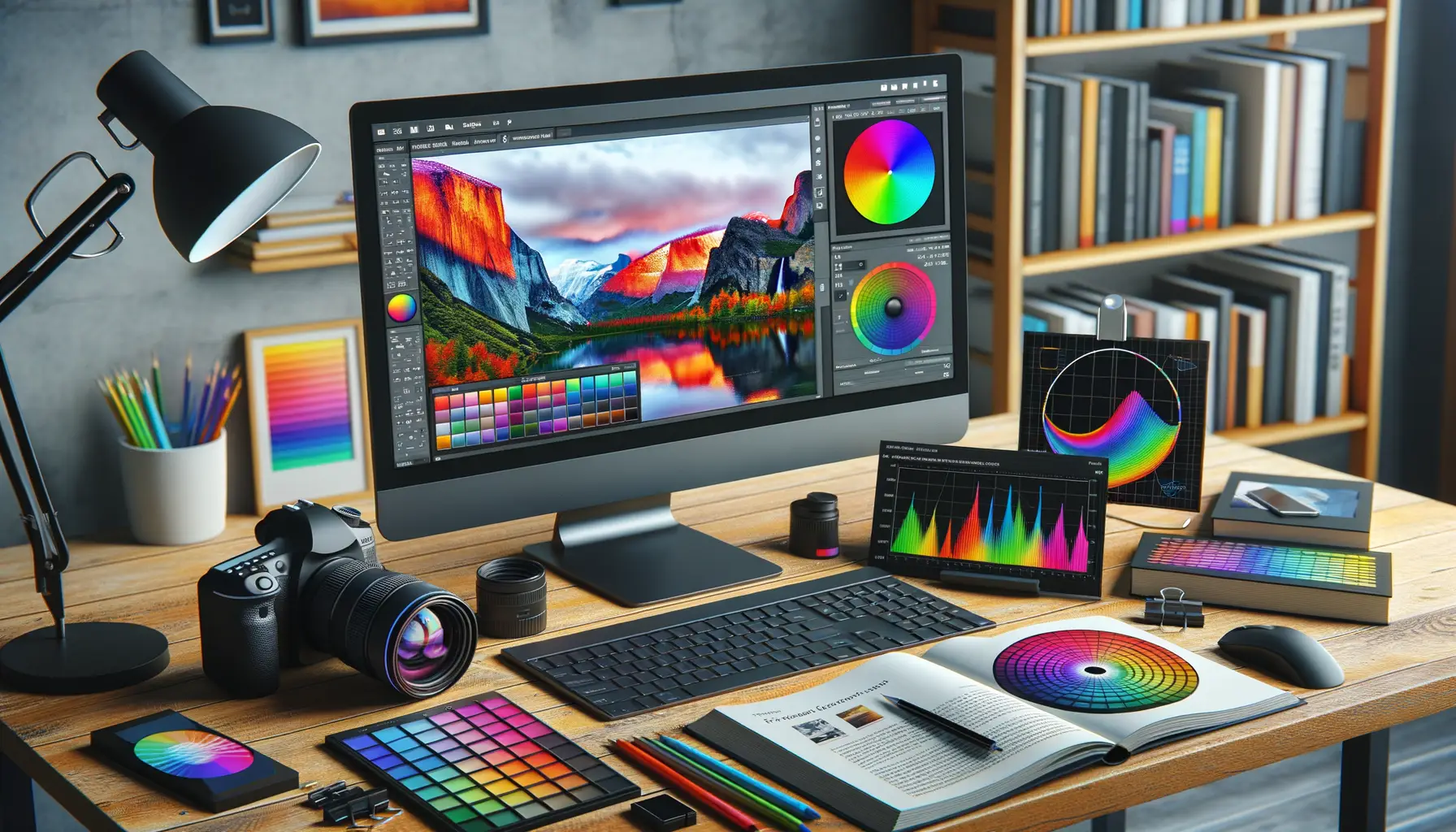
Choosing the Right File Format for Different Images

Understanding Your Image’s Personality
Choosing the right image file format is a bit like picking clothes for an event—each one has its perfect occasion. Want that logo to look crisp and professional? Or maybe you’re sharing a dreamy landscape? Let’s break it down.
JPEG is your go-to for photographs or images with lots of colors and gradients. Think family vacation snapshots or product photos. It keeps quality decent while shaving off unnecessary weight for faster loading.
PNG, on the other hand, is like the friend who shows up in full glam. It excels with transparency and sharp edges, making it ideal for logos, icons, or intricate graphics where every detail counts.
GIF is quirky. While it’s best known for short animations, it can handle simple graphics with fewer colors. But beware—it’s not built for detail-heavy work.
Pick wisely—your website deserves images that dazzle without dragging their feet!
Implementing Lazy Loading and Responsive Design

Why Your Website Needs Lazy Loading Yesterday
Imagine this: your website visitors are holding a stopwatch. Every second counts, and long page load times? That’s like asking them to wait for paint to dry. Enter lazy loading—your secret weapon to keep them hooked without overwhelming their browsers.
Here’s the magic: with lazy loading, images don’t load all at once. Only what’s visible on the screen gets loaded, saving precious bandwidth and speeding up the experience. Why force your users to download that footer image they haven’t scrolled to yet? You’re basically Marie Kondo-ing your page: less clutter, more joy.
And implementing it is simpler than you’d think. Just add the loading=”lazy” attribute to your images. Voilà! Your site breathes easier, and so do your users.
Responsive Design: The Key to Seamless Image Perfection
Picture this: someone’s browsing your site on a phone, and instead of a crisp, mobile-friendly image, they get a massive desktop-sized photo. Yikes. That’s where responsive design saves the day.
By using srcset and sizes attributes in your HTML, you tell browsers, “Hey, serve this smaller image for small screens and only go jumbo when needed.” Think Goldilocks—images that are just right for every device.
Don’t forget these steps:
- Test your site on different screen sizes.
- Optimize layouts to prioritize visuals without sacrificing speed.
The result? A browsing experience so smooth, your users won’t even notice—they’ll just feel it.
Tools and Resources for Effective Image Optimization
Powerful Tools to Transform Your Website’s Image Game
If you’re striving for lightning-fast website load times, having the right tools in your arsenal isn’t just helpful—it’s a game-changer. Imagine wielding these resources like an artist finely tuning their brushstrokes. Here are some standout picks to make your image optimization journey smoother:
- TinyPNG: Perfect for compressing images without sacrificing quality. It’s like magic—your file shrinks, but your visuals stay stunning.
- Squoosh: A browser-based tool from Google that gives you full control over quality, compression settings, and more. Think of it as the Swiss Army knife for image editing.
- Adobe Photoshop: For detailed resizing or custom compression, this powerhouse makes tweaking every pixel a breeze.
- ImageOptim: Great for bulk compression on Mac, saving time while keeping clarity intact.
Resource Treasure Chest for Optimization Success
But tools are just the beginning—you need resources to guide you through the maze of formats, resolutions, and device requirements. Check out the PageSpeed Insights by Google to pinpoint slow-loading culprits. For technical perfectionists, dive into Web.dev tutorials to master responsive design principles. Or bookmark the Can I Use database to verify browser compatibility for modern image techniques like WebP.
Remember, using these tools and resources is less about ticking boxes and more about creating an experience where visitors want to stick around, explore, and engage with your dazzlingly fast site.